E-Commerce project | Shopping App
Problem Statement | Abandoned Carts
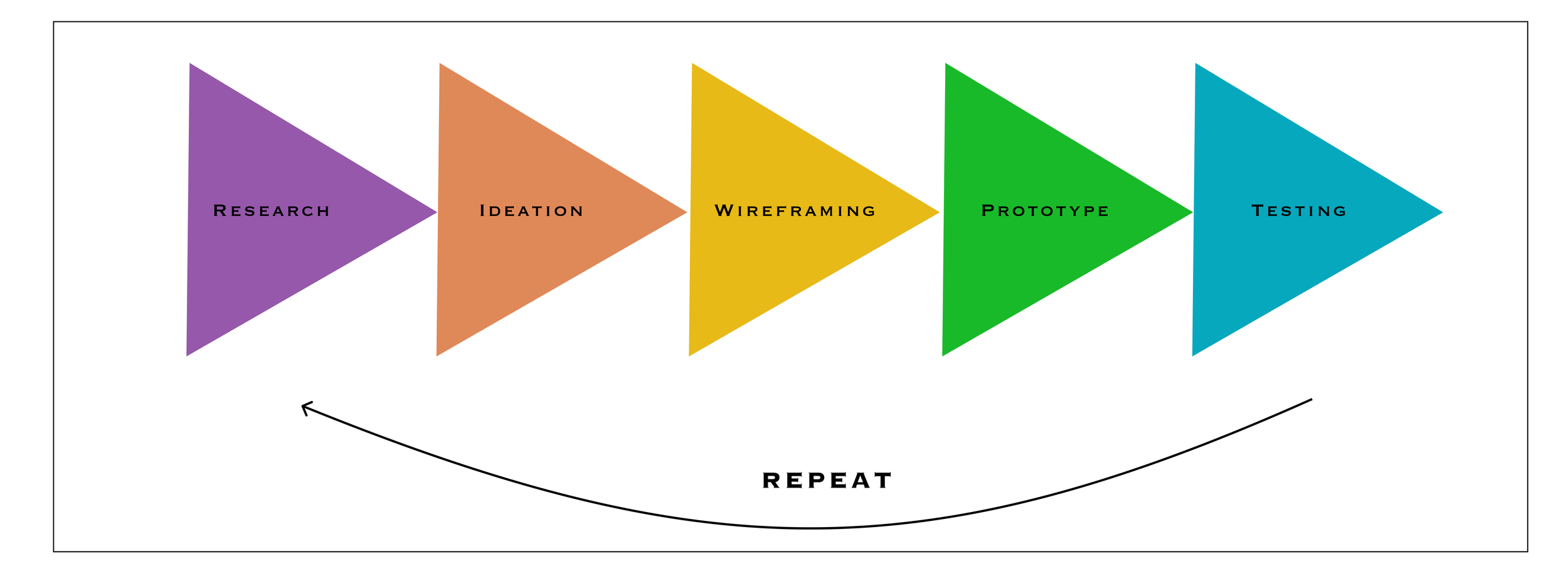
A shopping app selling Beauty products is seeing an increasing number of abandoned carts. Multiple factors are involved and are mainly related to the platform’s User Experience. To get a deeper understanding to the problem and reach an optimal solution. I will be using the design thinking methodology, where each phase will be thoroughly detailed below.
Design Methodology
Research
Research methods: Heuristic evaluation | Surveys | Interviews
Heuristic evaluation Insights
Cognitive Load | When multiple products are displayed with tens of offers and deals, users feel distracted and loose focus on the essentials, which leads to exhaustion hence abandoned items in cart.
Hidden fees: To their surprise, users find added fees to their cart (shipping + Taxes), they take a step back and browse for better deals.
Personas | Surveys & Interview Insights
I use Sephora App , No hesitation when it comes to products I am familiar with, I just wish I had the same at store experience within the app, the virtual assistance is not enough.
Kelly, 40 | Sales manager
Elizabeth, 30 | Realtor
It takes me days to finally find the product that goes with my skin tone.
I go to the store, get the one that fits me, then look up online if I can find a better deal.
An app that does the job already, would be helpful.
An app that browses for you the best deal on the same product
Anna, 25 | Student
I buy my essentials at MAC. They have a very good feature called Try ons, where I try make up virtually.
I add to the cart and wait for sales then process it.
Beauty products are expensive, especially premium quality. With my restricted student budget, I can not afford buying full price.
An app that will help find best quality products with a good price and high tech features.
IDEATION
Potential solution | Recreate the in-store experience within a platform
Users are looking for a platform that offers beyond Beauty products, users need an in-store experience with a guidance and product testing :
Help decide on which look matches their features by offering them a virtual look try on.
Offer Diagnosis to help users get the matching product to their skin.
Choose preselected makeup style and purchase needed products to create same look .
Display other vendors prices to let users compare.
Reduced Cognitive Load
Alternative solutions
Virtual assistant guiding users throughout their navigation.
Cons: Most of virtual assistant are automated messages, which sometimes adds up to user’s frustration.
2. Follow up emails and notifications to remind users of their left items in the cart.
Cons: This feature puts more pressure on the shoppers and get ignored most of the time.
WIREFRAMING
Red Routes, User flows, Low Fidelity, High Fidelity
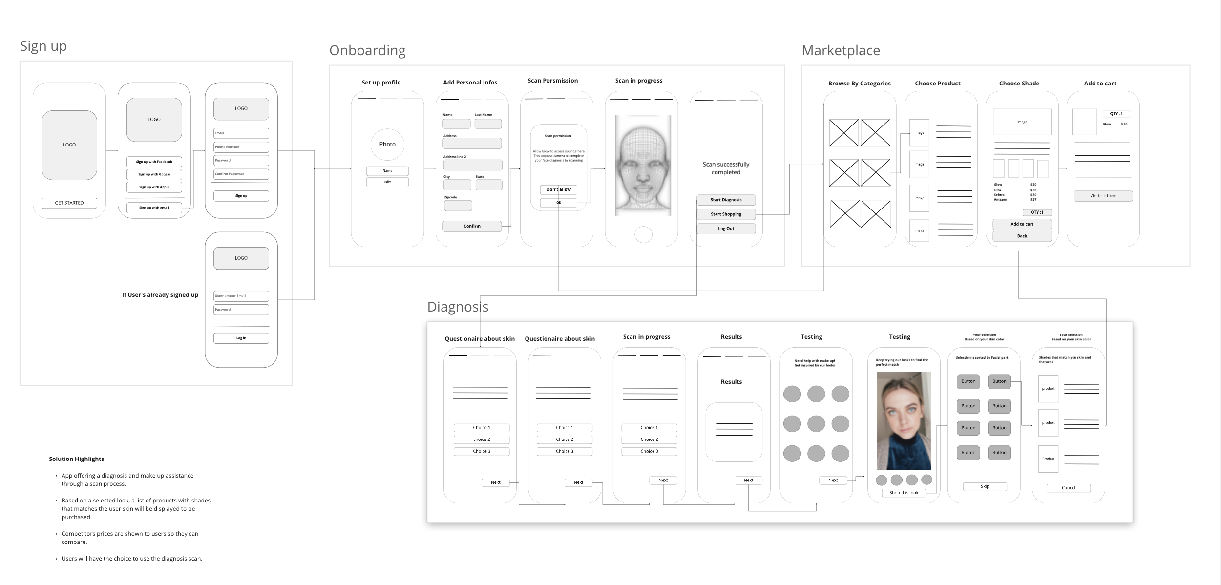
Breaking the app into four main Red Routes, each Red Route guides the user through a straightforward and smooth navigation
User Flows
Low Fidelity Wireframing
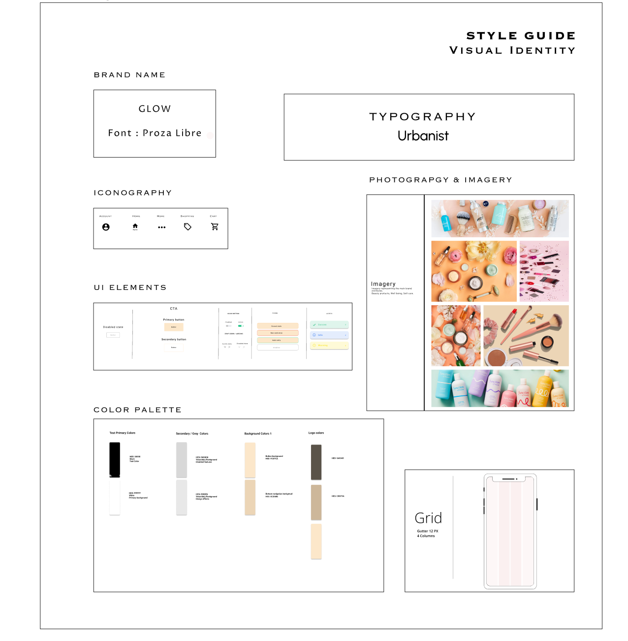
Visual Identity
Based on the latest 2022 Design trends for Beauty inductry, I built the following Style guide representing the general visual identity of the project as well as the UI kit used for the UI design
How Might We?
How might we Guide users throughout their shopping journey?
How might we recreate the same in-store experience within an app?
How might we help users choose the right product for them with no hesitation?
How might we Make them fill their carts without abandon it?
User’s pain points
Could not decide on which product to choose.
Hard to find a matching tone to their skin.
Fear of buying the wrong product.
High prices and surprising hidden fees at the check out.
User’s needs
Guidance throughout their shopping process.
Help choosing the right product for their skin and features.
Have a full control over the purchase without feeling any pressure)
Example of two beauty products platforms used throughout the Secondary research
Following the Heuristic Evaluation and Competitors Benchmarking, I conducted a profound study using surveys then interviews to get deeply into user’s needs and pain points.
In order to detect the needs and pain points, I created the following Personas representing the targeted users.
Paint Points | Needs | HMW
High Fidelity | Wire-framing
Flexible signup | users have control over their signup methods wether with Facebook, Google, Apple or email. Users can also access the app as a guest.
Onboarding
Users test their skin texture using a quiz and a face scan to personalize their shopping experience. The diagnosis and “Looks try on” features remain user’s choice.
The “Look try on” feature allows users to try different make up style and choose the one that matches their face traits, then a list of products displayed to buy in order to recreate the same look.
Market place can be accessible from Onboarding, Diagnosis or Bottom navigation. Each product is displayed with competitors prices to help users compare without having to leave the app and check each platform.
The goal is to provide users with all needed tools to complete their shopping with conviction hence leading them to checkout without leaving items in the cart. The payment has a straightforward process for users who are already registered and logged in. For guests, they will be redirected to a registration screen to put their personal and shipping information.
Payment
Marketplace
Straightforward onboarding requiring a minimum of information from users.
SignUp
Diagnosis
Initial prototype prior to testing and validation
Usability Test insights
Following a round of usability testing, here are some insights that will be taking into account onto the next iteration hence the final prototype.
Plain UI design
Contrast discrepancy
Lack of Logged in user flow
Final Prototype
In order to keep focus on the main issue and fit the project within the given timeframe, I developed and demonstrated the main Red Routes that are essential to the solution. Granted that I would have had more time, I would have done a deeper dive into the details of the project such as all possible states of each process.


