Medical and gaming app for Stroke survivors
PROJECT GOAL
Identify best practices and user experience requirements in stroke rehabilitation solutions.
Incorporate usability testing with stroke survivors and caregivers to ensure diverse user input.
Redesign to improve the user experience, increase engagement and align with user rehabilitation goals and business objectives.
Implement a robust human-centered design approach for both Secondary and primary research.
THE CHALLENGE
Client developed a stroke rehabilitation app using motion sensor technology and gamification to enhance upper body mobility. They require UX research and design to enhance user experience, especially in terms of user adoption and consistent, repeated engagement through user-friendly processes.
Problem statement
Business Goals
Our Roles
Yasmina Boulahcen
UI/UX Designer
Jennifer Moon
UI/UX Designer
Final product preview
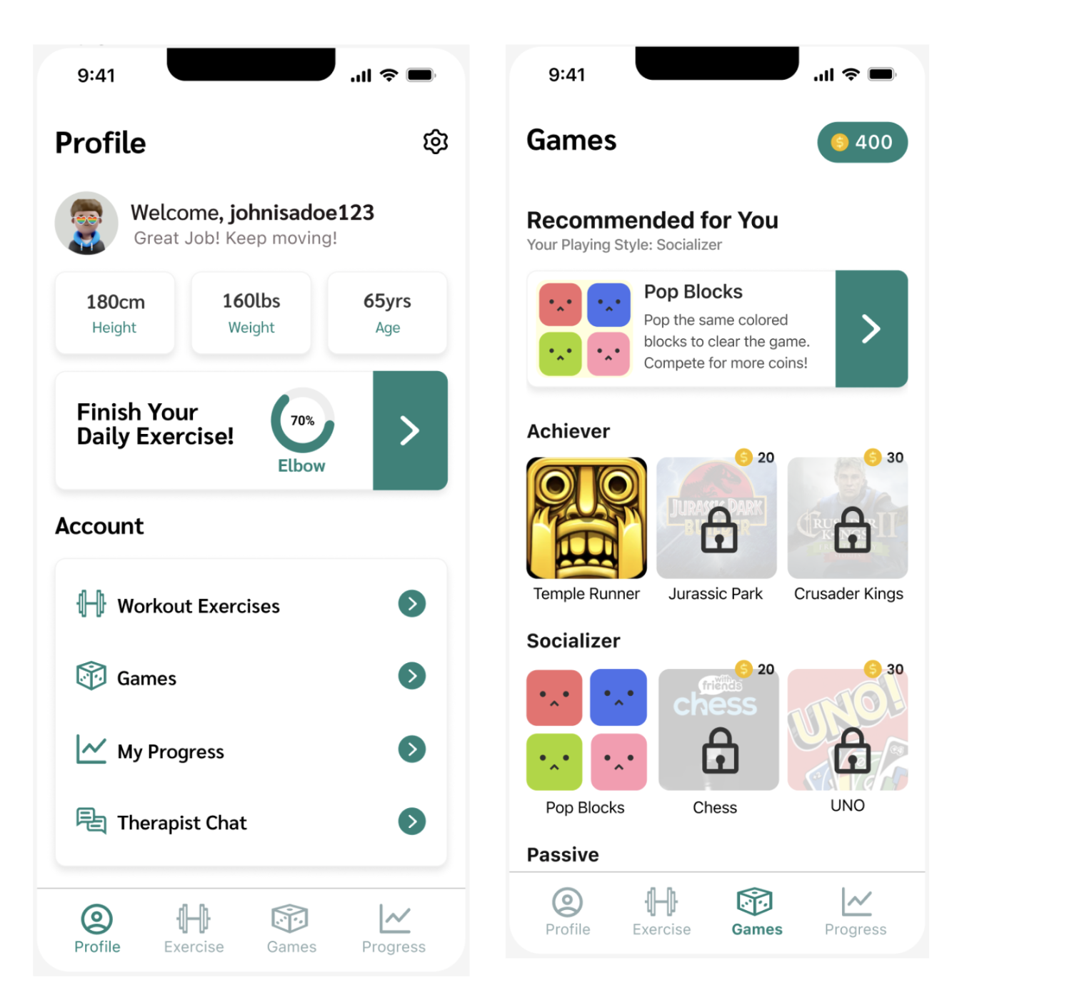
Among our design decisions, the character selection, home, progress, quests, and games/exercise screens received the most emphasis and went through numerous iterations based on user testing. These screens were crucial, demanding careful consideration to meet user and client business objectives
“We must design for the way people behave, not for how we would wish them to behave.”
― Donald A. Norman
Competitive Analysis
The startup aims to showcase a human-centered design prototype to attract potential clients, investors, and medical partners.
The client's current prototype lacks user-centered design and testing. Our mission is to validate user needs, redesign the product, and ensure usability and accessibility for stroke rehabilitation participants through rigorous research.
We've gathered sufficient material to embark on the critical Ideation phase, where we prioritize the user's needs and generate potential solutions. Here, we've formulated 'How Might We' statements to guide our path forward in addressing these needs.
User Flows
Greg Stevens
UI/UX Designer
RESEARCH
Insung Song
UI/UX Designer
Rebecca Noh
UI/UX Designer
Low Fidelity
We optimized the user flows to ensure an efficient informational architecture that aligns seamlessly with the users' specific needs
Our Approach
We followed the UX design thinking to create the solution in an iterative manner, to conduct testing at all levels of development utilizing the research and findings from primary and secondary research. This was a constant iterative process based on data, and focused on usability that met the goals discovered during research and testing.
Accessibility Audit
DESIGN IDEATION
Users Identification
The client provided low-fidelity screens, but they couldn't be effectively used for wireframing due to usability concerns. Considering our users are Stroke Survivors, the overwhelming amount of information and visuals didn't align with their accessibility needs. Despite this, we used the low-fidelity wireframes as a reference and foundation to grasp the client's vision and facilitate visualization.
We optimized the user flows to ensure an efficient informational architecture that aligns seamlessly with the users' specific needs.
SYSTEM DESIGN
Through a series of ideation sessions, our team extensively researched and developed a comprehensive Visual Style Guide that encapsulates the brand's core attributes and identity while adhering to accessibility standards. Utilizing contrast testing, we ensured the color palette caters to both Light and Dark modes, ensuring a consistent and inclusive design experience.
Pre - testing Hi-FI
HIGH FIDELITY
Post - testing Hi-FI
We implemented the chosen style guide by incorporating the designated color scheme, buttons, and UI elements into the app. To enhance accessibility and streamline the user experience, we simplified certain features from the original frames, considering time constraints and the need to minimize cognitive overload caused by excessive and repetitive information.
The most significant alteration from the original wireframes to the high-fidelity version was the redesign of the home screen. Initially envisioned as a 'playroom' style, we recognized the potential cognitive strain it might impose on users. Consequently, we opted for a simpler and more familiar home screen layout.
In our design decisions, we emphasized providing users with multiple navigational paths beyond the navigation bar to enhance accessibility. This approach aims to offer various ways for users to traverse the app, promoting ease of use and accessibility.
USABILITY TESTING
The purpose of this test is to evaluate the application's navigational ease, overall usability, and alignment with both business objectives and user rehabilitation needs.
Our primary business objective is to validate the enhancements made to the existing prototype based on research findings. Additionally, we aim to furnish our users with a functional prototype to showcase to potential investors, partners, and clients in the rehabilitation medical sector.
Our focus during testing was to assess the application's navigation efficiency for stroke rehabilitation goals and to foster sustained engagement.
The testing was overseen by the Project Manager Greg Stevens, with the team members rotating attendance. It was conducted remotely and involved stroke survivors and their family members from the United States, the Republic of Ireland, and Northern Ireland."
After multiple iterations guided by usability testing insights, the final prototype received client approval. Our part in this project concludes here; the next phase involves development and refinement by expert game designers.
Our primary aim was to actualize the client's vision, creating a prototype to showcase to investors and secure funding.


